Saturday 28 February 2015

A quick card for a Saturday morning

Yesterday I had a lovely day at the Make It Show in Farnborough. I didn't do TOO much shopping - in fact I went with a list and not only did I stick to it, I didn't actually buy everything on it - but I came away with loads of ideas and inspiration. I went to an encaustic painting workshop which reignited my love of it even though it must be about 20 years since I last did any, and a workshop with Debbie Moore showing us lots of ideas for making fancy folded and stepper cards with not a ruler, knife or scoring board in sight!

Anyway, before I can play with any of my new purchases or ideas, I need to clear up some of the bits and bobs out on my craft table, so I'm dashing in at the last minute to Pixie's Snippets Playground with a card I put together in a few minutes with some scraps of card and patterned paper. A bit of fussy cutting, a bit of die cutting and Robert's your Mother's brother.....


Thursday 26 February 2015

Everything stops for tea

If you know me in real life or on social media, you'll know that I am a card-carrying tea addict, so when I saw that the latest challenge at CD Sundays was Everything Stops For Tea I thought it was going to be easy. However, I couldn't find anything tea related on any of my CDs!

So, I decided to stamp an image and find a suitable background paper on one of my CDs. The image is a stamp I won from a magazine, it's a Papermania one and I've never used it before. I thought the ladies enjoying their afternoon tea looked very stylish and paired them with a background and (edited) sentiment from the gorgeous Joanna Sheen CD "The Age of Elegance" which I think I won in a previous CD Sundays challenge. You can't really see it in the photo, but I printed an extra sheet of the paper, this time in draft mode, to make an insert.

My idea with lightly colouring just the ladies was partly so as not to introduce lots of colours that didn't go with the paper, but also to give it the "hand tinted sepia" effect popular in the early part of the 20th century. However, I think it would have worked better with a more detailed stamp.


Wednesday 25 February 2015

Purple on Purple!

Here's another "What if....." thought I had today - What if I make a White on White card, but use a different colour? So here is a White on White card - made all in purple!


I highlighted a few areas with touches of purple glitter, but otherwise it is completely made from the same shade of purple card. I think the idea needs refining a bit - I'll lose the glitter next time. And if I'm going to use all one colour, I'll make it a pastel one, saving darker shades for when I'm using a plain white base card. But I think it's heading in a direction that could eventually be a great success.

I'm joining in with

Allsorts Challenge - The Colour Purple
Suzy Bee's Blooming Challenge - Monochrome

Snowflake butterflies

Recently I've been getting a lot of crafting ideas from looking at things I've made or used in the past and then thinking "What if.....?"

This time, I looked at some die cut snowflakes and thought "What if I cut some of the points out - would it look like a butterfly?". I was prompted to think about butterflies and snowflakes by a stamp that was in a little bag of freebies in my last Crafty Individuals order, saying "A snowflake is a Winter's butterfly"

So, I die cut some butterflies and started snipping. I can't say they really looked convincing, especially as they didn't show up against the backing paper I had chosen, so I die cut some plain butterflies and added the snowflakes as wings on top. Finished with some liquid pearls, I think they've worked quite well.


You'll have to take my word for the fact that the background paper is more of a blue-turquoise than green! Blue really IS the hardest colour to photograph. Now I understand what my Dad meant all those years ago when I pestered him to take photos of fields of bluebells!

I'm sharing this card with:

Rudolph Day at Scrappymo's
ATG with a twist - No red or green (It isn't green, really it isn't!) at Completely Christmas
Anything Goes at Christmas card Challenges
Holiday at Addicted to Stamps and More
Christmas - Let's see Some Snowflakes at Fab'nFunky

Sweet Potato and Cauliflower Curry


Sweet Potato and Cauliflower Curry

 
2 small sweet potatoes, peeled and cut into 2cm cubes
½ medium cauliflower, cut into sprigs
1 medium onion, chopped
1 x 400g tin chopped tomatoes
1 tbs tomato purée
1 tbs vegetable oil

Seeds: 1 tsp black mustard seeds
            1 tsp cumin seeds
            ½ tsp fenugreek seeds

ground spices:  1 tsp garam masala
                         1 tsp ground coriander
                         1 tsp ground cumin
                        ½ tsp ground turmeric
                        ½ tsp ground cardamom

 Cook the cauliflower in boiling water until just tender. Drain thoroughly and set aside.

Heat the oil and fry the seeds for a few seconds until they start to pop. Add the onions, reduce the heat and fry gently for 5 minutes. Add the sweet potatoes and continue frying for 3-4 minutes, then add the ground spices, mix well and fry for another 2 minutes. Stir in the tomatoes and tomato purée plus 1 tomato can full of water. Bring to the boil and simmer gently for 20-25 minutes until the sweet potatoes are tender, stirring frequently. If the sauce seems a little thin when the sweet potatoes are ready, increase the heat to boil off  any extra water. Then add the cauliflower and reheat gently.

 This serves 3-4 as a side dish, depending on what else you are having, or you could add a tin of chickpeas or black eyed beans at the same time as the cauliflower to make a complete one-pot vegetarian meal.  We served it with a mixed pulse dhal that Mark made and some home made naan bread.


Print Friendly and PDF

Tuesday 24 February 2015

Little Boy Blue at Cardz 4 Guyz

This week's Challenge at Cardz 4 Guyz is Little Boy Blue - rather than the nursery rhyme, I've interpreted this as a Congratulations card for parents of a new baby boy.

The stamp is a Woodware one, one of my very favourite new baby stamps that I return to over and over again. This time I have coloured it in with Promarkers, and highlighted the water with Glossy Accents and the bubbles with Stickles. The papers were a gift, and appear to be from a Canadian brand called Forever In Time.


I'm joining in with  the Make Your Mark challenge at Addicted to Stamps and More.

Monday 23 February 2015

Stained glass daffs

I've had this daffodil stamp for years - it's an unmounted one I got in a RAK, so I don't know its origins. In my glass painting days, I used to stamp it on acetate and colour it with glass paints, however when I got out my glass paints, neglected for about 10 years, they'd all dried up so that wasn't going to work.

First of all I stamped the design onto heat-embossable acetate. Most acetate won't work for this - it melts and buckles when the heat gun gets anywhere near it (Note to self - maybe it would be possible to create interesting textured embellishments that way). I get the embossable kind in small A6 sized pieces from a local craft shop. It needs to be embossed with clear powder, because even if you use an anti-static pad before stamping, a few grains of the embossing powder will inevitably stick to the acetate, so I stamped it with black Versafine ink and embossed with clear powder.

Having binned the glass paints, I coloured it in with Promarkers. They dry very slowly on acetate, and had a tendency to pool and streak - quite a contrast from using them on paper or card. When the colouring was dry, I cut out the acetate and mounted it onto white card with spray adhesive - most other kinds of adhesive would show through the acetate.

To make the backing card, I used an A6 card blank. I took a piece of scrap paper the same size as the front and folded it in half to cut the arch pattern, so it would be symmetrical, then used this as a template to cut out the card. I then covered the front with stonework paper printed from the CD The best of La Pashe 2012, trimmed it to shape and inked the edges.

I am sharing this with Sweet Stampin' Challenge Blog - Spring Flowers

Sunday 22 February 2015

Watch the birdie...

... or "The tale of the escaped canary"

While rummaging through my scraps, I found the remains of a sheet of green/blue wavy lined paper, that made me think of a bird swooping up and down in the sky, so it put me in mind of a very sweet little set of clear stamps that was in the wonderful goody bag I won in the January Charity Kit raffle at Hope and Chances. And if I could work them together, it would fit the "Wings" theme which is this week's challenge at Less is More.

I suddenly realised this morning that Santa had brought me three sets of "Create a scene" dies that I hadn't even opened. One of them is a village scene, and I chose the curviest die and used it to cut away the upper part of the front of a square card. Then I covered the inside of the card with my patterned paper and stamped a bird on it, stamping the word "Smile" roughly along the wavy lines of the paper across the width of the card.

I wanted to make the bird stand out more by paper-piecing it in in another colour. And I had in mind a yellow bird, but it's a cold, wet miserable February day in England and a Little Brown Job seemed to be more suitable. So I stamped one and cut it out, but it was no use, I couldn't stick it down, I wanted a yellow bird and I was going to jolly well HAVE a yellow bird. So another dive into my snippets to find a nice sunny scrap of yellow. There, I'm much happier now, but how did a yellow bird happen to be flying over the village? Well, it's an escaped canary of course!


I'm joining in with
Less is More - Wings
Fan-Tastic Tuesday - Use a Die
and of course, the Snippets Playground at Pixie's Crafty Workshop.
 PS - no, I don't know what the little line just above the bird's beak is for - I thought it was a fault in the manufacture of the stamp, but there's another bird in the set and it has ne too!

Saturday 21 February 2015

The Perfect Pear

A few weeks ago, I was lucky enough to win a lovely selection of acrylic stamps from the lovely Enfys at Going Buggy, many of which are perfect (or should that, in this case, be pear-fect?) for CAS cards, and today I'm sharing a card made with one of them.


I'm sharing this with:

CASOLOGY - Monochrome
Ooh La La Creations - Add some green
Suzy Bee's Blooming Challenge - Monochrome
Ruby's Rainbow - Anything Green  

Wednesday 18 February 2015

Favourite Things

For some reason, I woke up at 4am this morning humming the song "My Favourite Things" from The Sound of Music (and no, it wasn't to do with what I'd been dreaming.... actually I'd been dreaming that my Mum was feeding her cats on boiled aubergines, but the less said about that the better), and that set me wondering whether I could translate the song into a card.

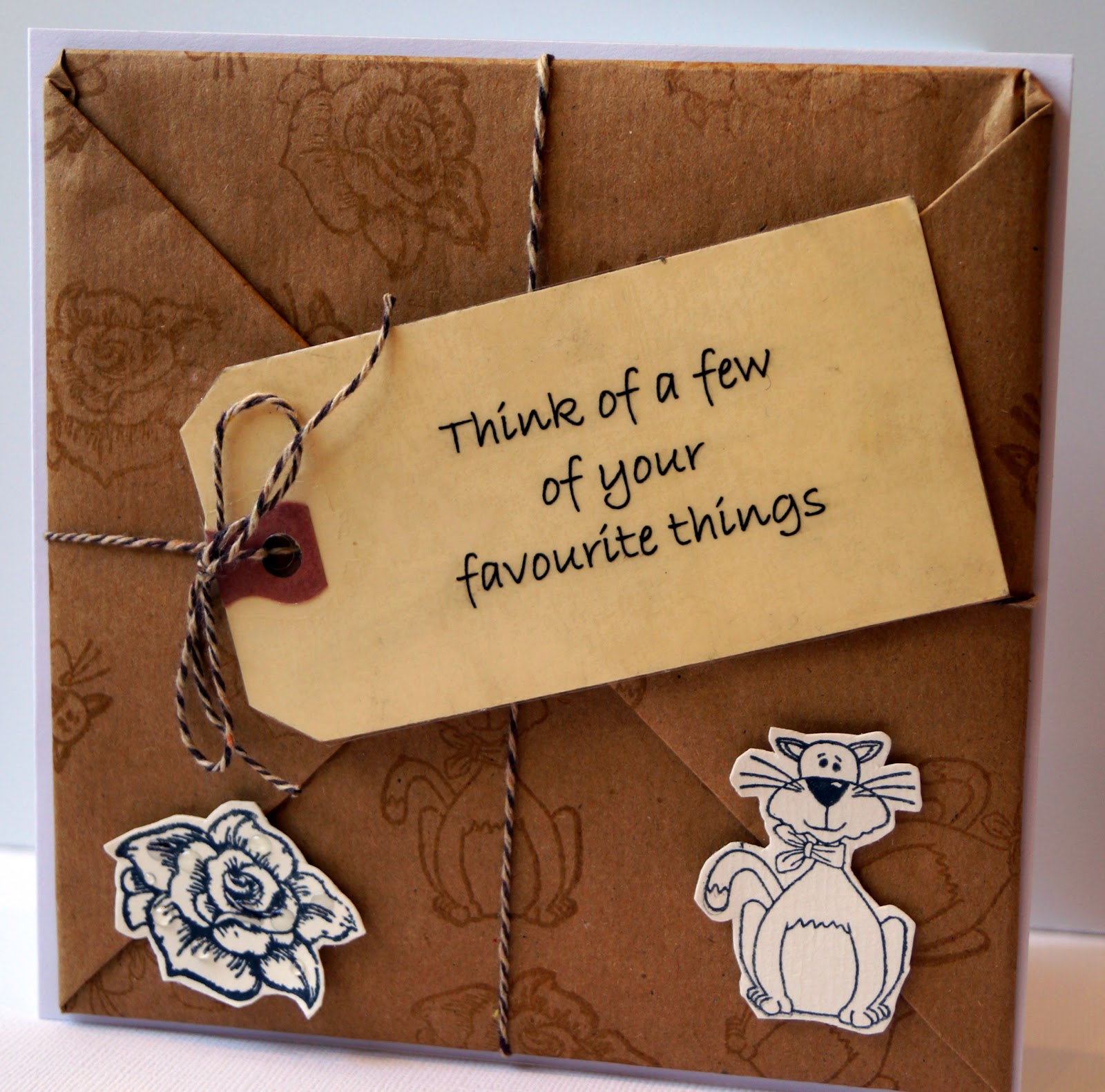
So I decided to make a "brown paper package tied up with string". Now I suppose I could have just used a square of kraft card, but I was in the mood for authenticity, so I decided to use proper brown parcel paper.

First of all I cut a 14cm square of very heavy card, to fit when finished onto a 15cm square card blank. Then I cut a 30cm square of brown paper, I wanted to stamp roses (raindrops on roses) and cats (whiskers on kittens) all over it. I tested both the shiny and dull sides with brown ink and with Versamark, and found I got a good clear but subtle image by using Versamark ink on the shiny side. so then I stamped the cats and roses randomly over my 30cm square.

Then I wrapped the heavy card square in the brown paper, parcel-style, trimming it to give a realistic finish and sticking down well at each fold.  I could have used the smoother side rather than the one with the flaps on as the front of the package, but I wanted it to be immediately obvious it was a "brown paper package" so the folded flaps had to be neat enough to show on the front.

Next came the parcel tag.  Again in the interest of authenticity, I wanted to use a real parcel tag, but I didn't have a stamp of the sentiment I wanted to use (and I doubt  whether one exists) and my handwriting is lousy. So I computer generated it in a handwriting font, adjusted the size to fit my tag, then printed it onto printable acetate. I then ran my tag through the Xyron to get an even layer of adhesive on it and placed the acetate down over it with the sentiment centred on the tag and trimmed the acetate to size, then repunched the hole.

The next job was to make it "tied up with string" so I used some brown and cream bakers twine to tie my package, adding the tag and a bow as I tied the final knots in the string. After that, the parcel was ready to add to the card front. With so much bulk and weight to it, I used the extra strong red double sided tape for this - I HATE using it because those red backing bits stick to everything except the inside of the waste basket - in fact I can see one stuck to the side of my trousers right now!

This is all getting rather wordy - are you still with me?

Then I stamped the cat and rose again, onto cream card, and cut them out. I had intended colouring them in, but when I tried them on the parcel I decided that adding colour would just detract from the background, so I used them uncoloured, just adding a few "raindrops" of glossy accents to the leaves and petals of the rose.


You can't really see those raindrops on the photo but I promise you, they are there!

I think the finished card would make a witty "Get well" card, or just a card to tell a friend who was going through a tough time that you were thinking of them.

Aha! I've just realised why I was thinking about The Sound of Music, it's because I'm currently reading an autobiography of a woman who spent some years as a rather rebellious nun. Anyway, since this card is inspired by both a film and a song and is most definitely not a birthday card, I'm playing along with the following challenges:

Sweet Stampin' Challenge - Inspired by a Song
Shopping Our Stash - The Big Screen
That Craft Place - Inspired by a Film
Allsorts Challenge - Anything but a Birthday  

Tuesday 17 February 2015

Happy Chinese New Year

Our theme this week at Cards 4 Guyz is Oriental in honour of the forthcoming Chinese New Year,  and we'd love to see your Oriental creations this week. It doesn't need to be a New Year card, it can be suitable for any occasion, but it must be suitable for a man or boy. And I'll be popping over to say hello to everyone who joins in.

Oriental as a crafting theme comes in and out of fashion every few years, so you may well have something you'd forgotten about buried deep in your stash - that was certainly the case with the backing paper I used on this card. I must have had the booklet of papers for at least 10 years, yet I honestly didn't recall ever having seen it before! The red character card was a snippet left over from an ancient QVC kit - I think it was originally part of a card front - and the black just a random scrap that I stamped and embossed the kimono on.

I had planned to use a bamboo skewer behind the kimono, to make it look as if it was being displayed on a real bamboo pole, but with the patterned background paper it all looked too cluttered so I took it away.


I'm joining in with
Pixie's Snippets Playground - Week 164
Allsorts Challenge Blog - Any occasion other than birthday
Addicted to Stamps and More - Anything Goes  
Crafty Gals Corner - Anything Goes 
Inkspirational Challenges #76 - Photo Inkspiration

Sunday 15 February 2015

March of the Penguins

So, at the start of 2015 I planned, as I plan every year, to make two Christmas cards a week every week of the year. And here we are, half way through February, and I've just made my first of the year.

Do you remember the film "March of the Penguins"? It struck me as a rather unusual film to have in cinemas rather than on TV, being a wildlife documentary, but it was very popular, and this little stamp I have of a line of marching penguins always makes me think of it.

I stamped the large penguin and baby first,  then masked it and stamped a line of marching penguins at each side to look as if there's a line of them in the background. The only colour I've used in the whole card is a tiny hint of orange for the beaks, but I've drawn in some very faint lines using Stickles to suggest snow and icebergs.

I'm sharing two photos, because to get the Stickles to show up I had to lose some of the whiteness of the card.


I'm playing along with these challenges:

Addicted to Stamps and More - Anything Goes
Addicted to CAS - Mask
Crafty Hazelnut's Christmas Challenge Extra - February  
Allsorts Challenge - Any Occasion Other than Birthday
That Craft Place - Inspired by a Film

Saturday 14 February 2015

Happy Valentine's Day

Ironic, isn't it, that over the last couple of weeks I've shared several Valentine's cards with you - and yet I haven't made one for my husband. Although to be fair, we had agreed well in advance that we weren't going to exchange cards as we don't really bother with Valentine's Day, apart from making sure we have a nice dinner and a bottle of wine - which we do every Saturday anyway!

However this week the challenge at Less Is More is a one layer challenge with the theme Love, so yet again as far as my crafting goes, love is in the air.

Earlier this week, I'd been very taken with the acrylic block background described on the Whiff of Joy blog,  had a little play on some scrap paper and thought it would be a great technique to bear in mind for one layer cards, so I couldn't wait to start playing this week!

I used a Picked Raspberry Distress Ink pad to cover my acrylic block, then spritzed it with water and used it to create a rectangle in the middle of my card. Once it was dry, I stamped the "LOVE" stamp - this was from a bundle of clear stamps that I won in a blog giveaway recently - and the tiny hearts,  in Memento ink. Then I coloured in the hearts. I didn't have a distress marker to match the inkpad but found a pretty close colour match among my markers.

Wednesday 11 February 2015

Pastitsio #RecipeClippings

When I first started clipping recipes from magazines, I used to carefully cut each one out and stick them into those photo albums that had plastic page covers - ideal to use in the kitchen as they are wipe-clean. Eventually the clipping mountain got too tall and the albums were no longer available, but I have about 10 of them and some of them get more use than many of my "real" recipe books. But among the much-loved and oft-revisited recipes there are still quite a few "must get around to trying this" ones, and Pastitsio was, until last night, one of them.

I'm not sure where the clipping came from, but the font looks like that of Good Housekeeping at about the time this album was being put together, probably 10-15 years ago.


The dish is a deeply savoury minced lamb dish, flavoured with thyme, oregano, cinnamon, cumin, ginger and nutmeg and cooked in a tomato, onion and white wine sauce. Cooked macaroni is stirred into the sauce


then it is topped with a cheese sauce that has two eggs beaten into it


and baked in the oven until the savoury custard topping is set and browned.


Our verdict - we thoroughly enjoyed it, but its main function was to remind us how long it is since we'd had the South African dish  Bobotie, also a lamb dish topped with a savoury custard, but with hotter spices and the addition of dried fruit.

Why not give it a try - it makes a great change from Lasagne!

I'm joining in with #RecipeClippings at Farmersgirl Kitchen


Butterflies and Ribbon - GDT for Butterfly Challenge

This week I am very honoured to be the guest designer at Butterfly Challenge, Mrs A's fortnightly challenge for butterfly-themed cards.  The latest theme is Butterflies and R is for Ribbons.  I decided to experiment with White on White for this card. On the actual card, the ribbons look pure white and the crystals are clear, but natural light being in such short supply at  this time of year, the ribbons have ended up looking cream and the crystals blue! If I'd known that was going to happen, I'd have used pearls instead of crystals on the butterflies bodies, so they would match. But on the other hand, then they wouldn't have matched so well in real life!


Tuesday 10 February 2015

Puppy Love

Will you please stop singing that cheesy old Donny Osmond song? I've only just got it out of my head after making this card!

This is my card for this week's Cardz 4 Guyz challenge, which is Puppy Love. We'd love it if you popped over to the challenge either to enter your own work or to get some inspiration for your male cards.

This card was going to be a straightforward CASE of a card I've seen on Pinterest, but it developed a life of its own and ended up very different from the original. The black and kraft colour scheme and the paw print background made with Versamark ink stamped onto kraft card are about the only features that remain. I absolutely HAD to work in some of the cute doggy silhouette ribbon and the wooden bone button that came in a mixed bundle from a whim purchase on eBay.

I used Glossy Accents just on the nose - after all, every dog should have a cold, wet nose!


I'm sharing this with

Anything Goes at That Craft Place

Monday 9 February 2015

A Celtic card

I've had a lovely afternoon playing! What started out just as my entry into this week's Pixie's Snippets Playground has turned out to also be my latest Design Team post for Foilplay where you can buy the Tonertex pen and foils that I used in this card.

A rummage through my snippets box yielded several interesting bits in browney-creamy colours,  including the mottled cream and brown card I've used as a background. This was from a pack I bought at The Eden Project several years ago and fascinates me as the brown swirls have been made by actually embedding fine coffee grounds into the card.

The sort of distressed gold metallic card is from a kit I bought many years ago from QVC - many thousands of us bought it and then couldn't think of a thing to do with it once we got it home! And I still have a few snippets of the gorgeous patterned metallic cards that were the part of the kit that drew me to it in the first place.


I stamped the dragonfly (stamp origins lost in the mists of time) and Celtic knot (Clarity stamps) on a snippet of pinkish-brown card and embossed them, then coloured in the knot with markers in three shades of brown.

The antique text - again, I can't remember where the stamp came from - I stamped onto cream card using Versamark ink. I then brushed gold and copper pigment powders over the stamping, rubbing them in well with a tissue and blowing off the excess, and fixed it with a tiny spritz of water. I aged the edges slightly with Tea Dye distress ink.

Now the fun bit. I used a Tonertex pen to go over the large letter B on the manuscript, and also to go around the backing card, using a rather haphazard scribbly movement to give the line a slightly "torn" look to it. When the pen had dried to a clear, tacky texture, I foiled the B in gold and the edges of the card using a "distressed gold" foil very similar in appearance to the scrap of metallic card. The photo doesn't really do the foiling justice - Hang on, I'll try a different shot......

... right, I'm back! Not such a good photo of the card this time, as I had to get into a rather awkward position in order to get light reflecting off the foil, but it does give you an impression of the wonderful rich shine!


So there you are, I've had a lovely afternoon playing around, rediscovered some long lost friends in my snippets box, used lots of different techniques and thoroughly enjoyed myself.... isn't crafting wonderful?

Tuna Waldorf Salad

Makes a nice  - and healthy - lunch for 1, or you could serve it in lettuce cups as a starter for 3-4


Simply mix together 1 small (60g) tin no-drain tuna, 1 stick of celery, diced, 6 walnut halves, roughly chopped, 1 small red-skinned eating apple, cored and diced and 1 level tablespoon of reduced fat mayonnaise.

The one that (almost) got away

I've been planning this card for days, ever since I saw that the current challenge at CAS-ology is Hot . I knew that *somewhere* I had some of my chilli images, left over from the ones I created for my husband's Christmas card but I had to turn my scraps box out twice before I found them.

Then I decided that they weren't shiny enough, so after cutting them out, I sprayed them with Spray'n'Shine. But being such small pieces, it was hard to spray them without blowing them away, and I ended up with some patchy bits and some bubbly bits - and they STILL weren't as shiny as I would have liked them to be! I mounted them on the card but wasn't happy with them.

So next, I covered the red parts of the chillis with Glossy Accents.  My bottle of Glossy Accents is rather old and gloopy, and I got pretty uneven coverage, so before attempting a second coat, I had a furkle in the nozzle with a fine needle. Result - it whooshed out and formed a thick layer. Even, but thick.

By now, I only had a few hours left until the challenge was due to close, but I had to leave the Glossy Accents to dry, so I moved on to another project for a couple of hours. But it was showing no sign of drying at all, so I impatiently grabbed my heat gun and gave the chillies a blast with it.

Well..... the Glossy Accents dried almost immediately. It also turned cloudy, buckled, cracked and blistered....


Not a great look!

Fortunately I still had three chilli images left, so I started again - and this time I decided to just accept that they are not bright shiny fresh chillies but simple paper images of them! So here, right at the last minute, is my shine-less hot chilli card!


Sunday 8 February 2015

Happy birthday to Less Is More

This week it's the fourth birthday of Less is More, the clean and simple challenge blog. I've not been with them ever since day 1, because  this blog isn't quite three years old yet, but I discovered LIM in June 2012. CAS cards were a whole new style to me, and thanks to LIM I've learned a lot about them so that now it is one of my favourite styles.

This week's challenge is a colour challenge - Pink and Grey. But I've brought in the idea of four, by using two shades of each, making four colours in all. And I think the sentiment echoes how we all feel about Less is More!

Saturday 7 February 2015

Whoo-ooo loves you?

This will probably be my last Valentine's Card for this year - all those ideas that have been cluttering up my brain have gradually been converted into paper and card and I'm beginning to think ahead to spring.

This card came about because the markings on the owl's breast looked rather like cute little hearts, and I wondered how it would look set against a night sky where the moon was replaced by a die cut heart. I rather like the result - I think a "heart moon" is going to appear quite often on my cards in future.

The owl was a free stamp from Craft Stamper magazine several years ago and the branch was from a set of stamps that came with another magazine, I think it was called Get Stamping and the stamp set came with the last ever issue.

I've left this free of words so that it can be used for any romantic occasion, not just Valentine's Day.


I'm sharing this with the following challenges:

Crafty Creations Challenges #282 - Owl Love You
Crafting Musketeers #22 - Cute
Suzy B's Blooming Challenge - Add something with wings
Sweet Stampin' - Add a Heart   

Friday 6 February 2015

All you need is love

When you're as unromantic as I am, thinking of ideas for Valentine's Cards is quite challenging and thinking of ones suitable for men even more so. But that's what the latest challenge at The Male Room is about so I had to get my thinking cap on.

I've used the Clarity Stamps "All you need is love" stamp, embossed and coloured then mounted on top of red card embossed using the Darice sheet music folder and lightly sanded. I think it's suitable for any man - or indeed any Beatles fan!

Hugs and Kisses


At the rate I'm turning out the Valentine's cards, I think I'm going to need to get myself a few boyfriends, as I've made FAR too many for my husband.

Hang on, don't boyfriends take up valuable crafting time? Scratch that idea then!

I've made this card for the Hugs and Kisses challenge at Addicted to CAS

 
The idea came to me earlier this week, when I was crafting with one of my granddaughters, using some free magazine stamps I'd set aside for them to use, thinking they were too "young" for me. But these cute hugging bunnies definitely represent hugs and kisses, so the stamp has moved back into my own collection. (Well, I'm just "borrowing" it for a while)
 
The sentiment is from the same stamp set, and the gingham ribbon is part of a batch of self adhesive ribbons I bought by accident thinking they were washi tape.


Butterflies for Valentine's Day

I've been dithering over this card for days - I kept starting to make it and each time it headed off in a different direction and ended up either not including butterflies or not being suitable for Valentine's Day. Isn't it funny how craft can sometimes take on a life of its own and lead you off at a tangent?

Anyway, at last today the elements came together, helped by my remembering that I had a pack of pretty votive candle wraps that I'd bought from the wedding favour department of Hobbycraft. I backed one with red card and trimmed it to fit the card  and everything fell into place from there.


I'm sharing this with Butterflies & V is for Valentine at Mrs A's Butterfly Challenge

Wednesday 4 February 2015

Two for the price of one

I decided to have a play today - I rummaged in my scraps box and lifted out a handful of snippets of patterned paper in link/purple/lilac shades and another handful in greens.

On the first batch, I stamped a very open flower, which I think was a craft mag freebie, to allow the patterns to show through. The green papers I folded, cut a half-leaf shape with the fold as the spine, ran through my Ribbler (it's a little hand held corrugator - I don't know whether the Ribbler is in production any more, but similar albeit rather more flimsy items are available in the children's craft sections of shops like Hobbycraft and The Range). When opened out, they make lovely leaves!

With all the shapes prepared, I added candi centres to the flowers and curled the edges of the petals over the blade of my scissors.

The design that I had at the back of my mind had a huge cluster of flowers and leaves, but when I tried to assemble all my flowers I realised I had made FAR too many, and that they looked far better arranged in a more CAS fashion to allow each element to show up. So here you have it - two cards for the price of one!


I'm entering one or both of the cards, as appropriate, into the following challenges

Ooh La La Creations - Love  (card 2)
Make My Monday - Hearts and Flowers  (card 2)
Clear it out challenge -  Anything Goes  (both cards)
Pixies Snippets Playground - Week 162 (both cards)
 All Sorts Challenge - Flower Power (both cards)
Fan-tastic Tuesday - Let's see some purple (card 2)
The Crafter's Café - Birthday Card (card 1)


Tuesday 3 February 2015

Simply Sympathy

I always find sympathy cards difficult to make. Other events can be planned for - Christmas and birthdays come along on regular dates, and even babies give you several months' notice of their intended arrival. But death can be sudden and unexpected, and I don't like to have suitable cards "in stock" so whenever I need one it has to be one I can make quickly.

I also think that CAS cards are very suitable for the occasion. Going overboard with pattern or embellishments doesn't really seem right, and the recipient won't be in any mood to appreciate them, they just want something simple to tell them that you are thinking of them.

I love this agapanthus flower stamp and it often finds its way onto the sympathy cards I make, although it is equally at home on a landscape or a bright, colourful card.

I masked off part of the card front and then sponged purple inks in three different shades over the left hand area, starting each at the masked edge and flicking it out with a soft sponge so that it faded towards the edge. The purples have blended together to give a subtle, graduated effect with the palest going almost to the edge of the card and the darkest closest to the masked edge. Then I used my trusty stamp positioner to add the agapanthus and the sentiment.


I'm entering this for the following challenges:

One Layer Simplicity - You Blend - my first visit to this challenge
Fan-tastic Tuesday - Let's See Some Purple
Addicted to Stamps and More - CAS
CAS on Sunday - #51 Flowers

Economical Cookery - 1937 style

One of my favourite recipe books is a thick volume called "Economical Cookery" published in 1937. It was given to me by a boyfriend's mother while I was at school - I think she had romantic notions of me and her son staying together forever and the book becoming a family heirloom. Ha! I'm delighted to say that my relationship with the book has lasted many times longer than my relationship with her little boy did!

It is aimed at the sort of middle class families who, between the wars, found that their way of life had changed. No longer did quite ordinary people in ordinary homes have staff to cook and clean for them, and housewives were suddenly finding that they had to learn skills that they hadn't been taught by mothers who had thought, at the time, they would never be needed (and probably didn't have the skills themselves).

So the book covers everything from absolute basics, like how to use an oven, and how to mash potatoes, to dishes that wouldn't look out of place at a modern dinner party. But the emphasis is on good value, everyday filling food for families, and although relative prices of some items have changed (for instance in those days poultry was a luxury compared to other meats) I still find it a valuable source of recipes, especially for soups, stews and bakes.

But my favourite section of all is a set of menus for every single day of the year, each based on items that were in season or available dried or in tins, as frozen and many imported goods were either unavailable or far too expensive for the target audience of the book. Every item of breakfast, lunch and dinner is included, and the menu for each Sunday is costed out. The menus are very practical - Monday's meals usually include dishes made with Sunday's leftovers and the recipes for them are included in the book.

One thing that is immediately striking today is the sheer quantity of food! Three hot meals a day  with pudding at two of them! With our modern, sedentary lives and constant snacking, we'd all be the size of double decker buses if we ate like that at mealtimes!

Here's the menu for the final Sunday of January


Just out of interest, I've checked the prices of the items at Ocado, going for the Waitrose Essentials items where possible. Here are the approximate equivalent prices today (for comparison, 1s then was 5p now, and 1d was about 0.42p and 1 oz = 28g, 1lb = 454g )

Breakfast
½ pkt cereal 50p
175g streaky bacon  £1.67
4 eggs 65p

Mid-day meal
2 guinea fowl £14.00
breadcrumbs 10p
500g potatoes 50p
1 large cauliflower £1
4 oranges £1.20
pack of orange jelly (for both meals) 54p

Evening meal
Celery soup (made with 2 heads of celery, 1 onion, 650ml stock, 25g flour, 50g butter and 250ml milk) £2.30
salad  - this could be almost anything, but for cos lettuce, ½ cucumber and half a pack of essentials tomatoes the cost is £2
sponge fingers 80p
cream (I presume you wouldn't make your own) £1.60
gelatine 50p

Kick Back and Relax

This week the challenge at Cardz 4 Guyz is Kick Back and Relax. We'd love to see your take on the theme - don't forget to make your card suitable for a man or boy!

For my card I've turned to the ever-popular La Pashe CD, The Best of La Pashe 2014, printing out this cute bear decoupage with the matching envelope backing paper plus a sheet of pizza design backing paper.


I was inspired to try this Large Square Double Display card after seeing this great tutorial on The Craft Spa  and found that by using my Hougie board for all the measuring and scoring, it took only minutes to produce the fancy folded card. I'm delighted to have found something so easy that looks so complicated!

As I've never tried this unusual fold before, I'm joining in with Crafty Gals Corner Challenge #4 - Try Something New
Also Anything Goes at That Craft Place
Also for the first time I've entered the challenge for Design Team members at Design Team Showcase